DealerOn
Website Optimization 101: Navigation Best Practices
How users get around your site is just as important as the content on it. If your navigation bar is confusing and cluttered, no one is going to stick around trying to figure it out. There are plenty of other sites with clean navigation, and your hard-earned users will be heading that way if they can’t get where they want as quickly as possible. Start with these navigation bar best practices to keep shoppers engaged with your site.
Keep Your Design Simple
We’ve all been on a mobile site that is cluttered and distracting, and we’ve gotten out of there as fast as possible. Don’t be that site. Be better. You only have 3 seconds before a user decides if they should stick around on your site or shop elsewhere, so make those 3 seconds easy and direct with a site navigation that doesn’t distract and gets users exactly where they want to go.
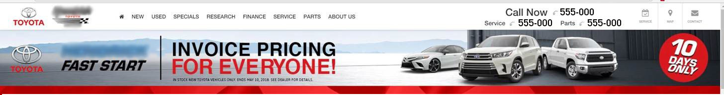
Your navigation should be at the top of the page and easy to see, but not so large that it takes up too much space. Balance out these two goals, and you’ll land on the perfect size. Mark your links clearly so users don’t have to think twice about where they want to go.
Organize With Strategy
How your links are organized has a larger impact than you might think. Users want the path of least resistance, so give them a good map to navigate your site by starting with most important links. Most users want to go to New/Used Inventory, Service, or Specials pages first, rather than Trade or Credit, for example.
If you want to know which of your pages are getting the most attention, you can use the Google Analytics User Flow Report to track how many people move through your site and how they’re doing it. This way you’ll know what your most popular pages are so you can link to them directly.
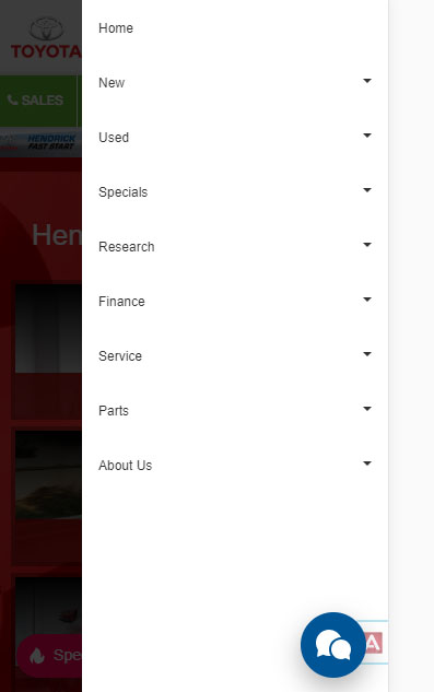
Don’t Forget About Mobile
You’ve heard this so many times that your ears are ringing but I’m going to say it again: Remember to have a mobile-first strategy. There are too many people—about 60% actually—using their phones to research a new car for you to ignore them. Your navigation bar should be designed with that 60% in mind. That means navigation that’s tappable with a font size that’s easy to read. Your search widget also becomes significantly more important on your mobile platform.
Navigation is important if you want to keep shoppers on your site, so follow these best practices to stay on top of your game. Keep your design simple and to the point, organize strategically so users don’t have to think too hard, and remember to use a mobile-first strategy. Keep these things in mind and you’ll be going places.
Recommended Posts
Function + Form
Functionand Form
Function + Form
Chrome Hearts Ring: A Timeless Symbol of Luxury and Rebellion
chrome hearts riing
How a Healthcare Marketing Agency in AZ Is Driving Real Results for Local Medical Clinics
james mark
physicians digital services
Find the Perfect Bike for Sale: A Complete Guide to Buying Your Next Ride
s6x india
s6xindia
Honouring Loved Ones: Choosing the Right Urns for Ashes in Australia
Urns For Sale
Urns For Sale
No Comments