DealerOn
Tappable sitelinks are here! How will this affect your advertisements?

Sitelinks are a Google AdWords staple. They take users to specific pages within your site, allowing searchers to find exactly what they're looking for. I’ve always been a big fan of them for a number of reasons; dealerships who use sitelinks take-up more ad space, and more importantly, sitelinks allow dealers to precisely focus their ads.
Recently, Google updated their sitelinks for mobile devices to allow double the number of links—now you can have as many as eight. With more links available, you can have an even more targeted approach for specific pages or products. And if you’d like to get the most out of this new update, use these links to provide searchers with shortcuts to high-converting pages or product-specific landing pages.
On top of allowing more links, the design of sitelinks on mobile browsers has changed. Dubbed by Google as, “Tappable Sitelinks,” links are now seen in a carousel format that allows for left-to-right swiping and easy tapping—a friendlier design that all mobile users will be happy to see. Before this update, users dealt with cut-off text and non-interactive links on mobile devices.
You can check out the improved design below:

This sitelinks improvement is a win-win for both sides, since searchers can now easily find the content they are looking for, and you can draw attention to more targeted landing pages and products. All dealers should take the time to consider exactly what pages they would like to spotlight. As I mentioned before, you’ll want to place a special emphasis on your highest converting pages, but I would also suggest that you focus on pages like New Inventory, Used Inventory, Specials, and Services. If you want to step outside of the box, you can experiment by running some model-specific ads with sitelinks that filter out those particular models. You can also prioritize your Service Center with service-specific ads, matched with various service-focused sitelinks. This will encourage you to create more service content and your fixed ops department will love the results!
VP of Marketing Shaun is a true internet car guy and the Vice President of Marketing at DealerOn. His automotive internet career began in 1998 with the Reynolds and Reynolds team that launched Microsoft’s CarPoint.com, CarsDirect Connect, Yahoo Autos, Automark Websites and Reynolds Web Solutions. Shaun’s Marketing prowess coupled with expertise in Social Media allows him to effectively market DealerOn’s capabilities, extend its reach and build the right reputation. His unique blend of humor and automotive experience has made Raines a sought after speaker at industry events including NADA, NCM, Digital Dealer, DrivingSales Executive Summit and 20 Groups Shaun lives in Frisco, Texas with his wife, children and dogs.
DealerOn
Third Party Tools Are Slowing Down Your Site. Here’s How to Fix It.

Your site is, in today’s technological age, the first thing most of your customers see. Site visitors become purchasers in the long run, and the speed of your site is an important variable in their decision-making process. On average, 40 percent of visitors will leave a site that takes more than three seconds to load, which means you don’t have any time to waste.
Third party integrations are one of the reasons your site may not be running as quickly as it could. Third party applications are the outside tools supplied by vendors, such as chat apps, service schedulers, trade application tools—anything that comes from an outside vendor. These tools are integrated into your site via third party tags, and careless integration can slow things down at best, and bring your site crashing down at worst.
Take these tips into consideration to streamline your third party integrations.
Communicate with Your Vendors
You should know what your third party vendor is supplying, how it will work, and what you can expect. A good way to know exactly what you’re getting is to have an SLA (service-level agreement). Include your minimum expectations from the tool and a way to measure potential performance issues, this way there can’t be any surprises.
If your third party is hosted in a different country from the majority of your visitors, you’ll want to find out if they use a CDN (content delivery network). Without one, your visitors will experience increased latency and slower load times. That’s enough to send most of them packing. You can also improve site speed by asking vendors optimize their scripts, such as minifying any JavaScript files.
Keep in contact with your vendors so you know immediately if they alter or update their third party tags. Outdated tags can cause a variety of issues for your site’s performance, especially if your code isn’t asynchronous. The web moves quickly, and if you miss an update your page’s loading time may suffer.
Synchronize Your Code
Speaking of asynchronous code, it’s good to remember that you don’t have complete control of your third party tools, which means you have to set up as many fail-safes as possible. This is where ensuring any third party code is asynchronous with your own comes in handy. This will prevent third party tags from having a dependency on your code, which can result in a SPOF (single point of failure) that could bring down your entire site.
Clean Up Waste
You probably have a lot of third party applications on your site, but are all of them useful? Take some time to measure a third party tool’s impact on your business. Do these tools line up with your performance goals? Are they significantly impacting your ROI?
To decide of a tool is worth having, analyze the percentage of conversion rate lost with each second of page delay caused by third party tools. We’ve talked before about the benefits of A/B testing, and this would be an opportunity to put it into practice. Provide one page with the third party tool and one without, and then compare the bounce and conversion rates. If there is a major difference, and the tool does not provide significant benefit to your business, you may consider eliminating it all together.
Third party tools are a necessary part of running a website, but they can quickly attribute to slow loading times if not watched carefully. Keep an eye on your vendors to make sure no outside forces can affect what’s happening on your site.
Michael joined DealerOn in 2011 and oversees the Design, Development and Production departments at DealerOn in his role as the Chief Creative Officer. With 15 years of experience in multimedia/web design, Michael is an expert in interactive design, UX, brand identity design, content creation and print collateral. Michael is responsible for the design and coordination of development of DealerOn’s responsive website platform, Chameleon which has fueled the growth for the company He has worked as a designer, writer and art director for a variety of companies including Marvel, DC Comics, Cartoon Network, Comedy Central, and MTV. Outside of his work at DealerOn, Michael will be serving as an Executive Producer for Walt Disney Pictures on an upcoming film adaptation of the New York Times bestselling graphic novel, The Stuff of Legend, published by his company, Th3rd World Studios.
No Comments
DealerOn
Website Conversion 101: Banner Blindness
![HomepageOp750[1]](http://www.dealeron.com/wp-content/uploads/HomepageOp7501.jpg)
Something that’s easy to misuse while designing your banner is animation. It is possible to walk the fine line between subtle, eye-catching animation and something distracting and out of place. Too much animation can lead to a negative association with your site—something every website owner should avoid.
The last piece of content on your banner should be your CTA (call-to-action). We’ve talked about the importance of CTAs before, and the importance of having a clickable button that brings site visitors closer in the purchase process. Your CTA should encourage some kind of action, such as “Get 10% Off Service” or “Receive a Gift Card with Test Drive.” Adding time-sensitive words like “Now” can also help drive a sense of urgency. This will create a need where clicking your banner brings about a solution.
Mike is a core part of the DealerOn team, and has led a complete restructuring and rebuilding of DealerOn’s account management teams team into the best in the industry during his tenure. Mike is universally loved by our customers. His website optimization expertise combined with his retail sales expertise are invaluable assets to DealerOn’s clients. His consultative approach to working with dealers has facilitated a number of platform enhancements, helping maximize consumer engagement and lead conversion for our customers. He can be reached at mikes@dealeron.com .
No Comments
DealerOn
Website Conversion 101: CTAs

I've talked before about the importance of a well-optimized site, examining specific elements of your website like the homepage. Well, today we're talking about the all-important Call-To-Action (CTA). To help you determine if your CTAs are doing their job, I put together a 5-question litmus test that you can try out today. Go ahead, take 'em for a spin.
If you didn't know, CTAs are the friendly, clickable buttons on your website that you want visitors to hit when they convert. For example, you might have a "Submit" CTA at the bottom of a contact form. But the uses go far beyond the practical - you can use CTAs to help expedite the conversion process by enticing your site visitors to go a few clicks further into the purchase process. Specifically, you can create a want or a need with a well-designed CTA, which can help you achieve a goal. A basic example might be getting a potential lead to fill out a contact form on a vehicle landing page. Or maybe sign up for your monthly newsletter.
Even though they look simple enough (a small button and 3-4 words), a lot of thought goes into creating a well-optimized CTA. Or, at least there should be. Use these 5 questions to determine if your CTA game is strong, or needs some work.
1. What's the purpose?
Like I said earlier, the purpose of a CTA is to create a perceived want or need. If the goal is to get your site visitors interested in a particular vehicle, then "LEARN MORE!" at the bottom of your internet pricing specials might push someone further into the conversion process. But we can get more specific than that, can't we? "GET PRICE QUOTE" is actually a little more specific. But what about a sense of urgency? "GET PRICE QUOTE NOW!" is even better.
Think of your CTAs like signs pointing to the finish line. Decide what purpose your CTA serves and make it as detailed as necessary. Make it as easy as possible to click. Don't make it too wordy and don't make it too generic.
2. What are you saying?
Let's talk about messaging, or how we can further appeal to the customers visiting your website. Consider the example from above. The messaging on that Toyota Camry vehicle page is personable, right? You're not telling people that all Toyota Camrys at your dealership cost this much, No, you have special discounts & incentives to give someone their own custom price. Handpicked for them, right?
Your CTAs can be personable as well, by simply adding things like model specific or brand specific language. "GET TOYOTA PRICE NOW" is specifically referring to Toyota vehicles. However, changing it to "GET MY TOYOTA PRICE NOW!" gives even more of a personable touch. Not only is the messaging brand-specific, but it's personable for the customer as well. There are lots of variants on this, obviously, but the most-clicked CTAs tend to include some sort of pronoun.
Finally, consider including a more powerful action word, or verb, in your CTA. "Get" is a little generic, and it doesn't particularly give the customer an incentive to click. "Get" is pretty boring, to be honest. "SECURE MY TOYOTA PRICE NOW!" creates a sense of urgency, subtly inferring that the listed price won't last forever, and that you need to act soon. Obviously, there's a real opportunity to use branded words here. If you're famous for your "Davison Discount" at the Davison Toyota dealership, for example, then add that into your CTA!
3. Why are you saying it?
It's worth mentioning again: the purpose of your CTA is to help guide your website visitors through the conversion process. The overall goal is to take a website visitor, however they got there, interest them in your content, present an enticing offer, and make it as easy as possible for them to reach out and potentially become a customer for your sales team to handle. Of course, that means you want to keep people on your site. Don't link your CTAs to an external page, because that's effectively kicking those leads off your site and out of your conversion process.
Not everything is a lead generation effort, though, and sometimes data collection about your customers is the only goal. That information is valuable, and those CTAs might not be the most exciting things in the world. However, you can get a little more creative with those. For example, you might try "HIT ME UP!" as a CTA on your contact form, instead of the standard "SUBMIT." Hey, go wild.
4. Where are you saying it?
Variety is another metric to consider when optimizing your CTAs. Some people believe firmly in having just one CTA per page, while others advocate multiple. There's not really a "correct" answer here, it's driven by context. However, our own A/B testing data shows that multiple CTAs at the beginning of User Flows decreases conversion rates. In other words, if you bombard people with tons of buttons to click, they'll get sensory overload and not click any of them. Think about the old MySpace accounts, when people got a little crazy with HTML & colored fonts.
5. How do you look?
CTA placement on your website is just as important as the verbiage. First off, keep your CTAs as visible as possible! Always keep them above the fold, so that users don't have to scroll down to the bottom before they can take any action. Remember: path of least resistance. The key to making your CTAs visible is contrast. Of course, that rules out using any weird animation or flash to cover your CTAs or make them move.
Generally, it's best to pick contrasting colors on your website and use those. DealerOn's colors are blue and orange, and we tend to use our signature orange color, because it's very noticeable.
Wrap it up
There you have it, 5 simple-ish questions you can ask about your CTAs to see if they're as first-class as you are. Again, context will drive a lot of your decisions. Don't make the mistake of thinking, "Well, I always need a unique verb, and it must be personalized with contrasting colors." The mad scientists in the DealerOn labs have done thousands of tests to get the stats that work for our clients - which are auto dealerships. If you're not seeing results, start A/B testing different elements of your CTAs and fine-tune your own process.
Mike is a core part of the DealerOn team, and has led a complete restructuring and rebuilding of DealerOn’s account management teams team into the best in the industry during his tenure. Mike is universally loved by our customers. His website optimization expertise combined with his retail sales expertise are invaluable assets to DealerOn’s clients. His consultative approach to working with dealers has facilitated a number of platform enhancements, helping maximize consumer engagement and lead conversion for our customers.
No Comments
DealerOn
Rage Against the Machine: Getting Your PPC Automation Straight
 In the wonderful world of PPC, we've all come to know and love (to some degree) automation services. For most of us, using automation with our paid search efforts has made life easier. But, while it can certainly make your PPC campaigns run more efficiently, it can also waste money at a pretty alarming rate if not set up correctly.
Now, I love a good rock n' roll reference, so today I'm talking about raging against the machine of artificial intelligence so that you don't spend money on something that's simply not working.
There are three main areas I want to focus on here: ad scheduling, site links & ad extensions, and bid management by device type.
Schedule Those Ads
Today's technology allows us to auto-schedule a lots of things: your bill payment, doctor's appointments, A/C system, and more. But when it comes to setting a budget for your PPC campaigns, you may want to customize your own ad schedule so that you're not automatically spending money & clicks at pre-designated intervals. If you or your provider are constantly bidding the exact same amount of money on ads, regardless of the time of day or week, that's not an efficient use of your budget.
I've used this example before, but if your business isn't open at 3:00 a.m., but your PPC ads are running 24/7, what happens when someone clicks an ad and your store isn't open? Unless you've got a followup strategy, those are lost advertising dollars because any incoming lead won't have a chance to contact your dealership.
Sitelinks & Ad Extensions
When ad extensions were rolled out, it was a glorious day. From a customer's standpoint alone, having more information on a SERP is always a good thing, because everyone loves to make informed decisions. However, many ad platforms don't have sitelinks & ad extensions fully automated yet, so if you plan on using those, a manual setup and management will be necessary for optimal results.
When customers are clicking a sitelink within your ad, they rightly expect to be taken to the specific page they clicked on. If that isn't the case, and they're sent to another location, or just your homepage, that's a surefire way to see your bounce rate shoot up. It's really all about the expectation. If you trust your automation process to choose the right page, then go ahead. But if you've got a more specific ad campaign in the works, it may be a better idea to manually set the site links before hitting "Go."
Bid Management by Device Type
You might be tired of hearing this one, but you'd really be surprised at how often I'll do an audit of a PPC process, only to find that desktop ads were used on mobile platforms, and vice versa. Consider the device that will be accessing your ad, and then design it accordingly. As an extreme example, a towing company with 24/7 service options probably won't run a lot of desktop ads, especially late at night. Most of their target audience is stranded, and only has one connection to the internet: their phone.
Now, these three areas I've mentioned aren't no-zones for automated processes. But, in my experience, you DO need to have some human oversight into how the automation is set up, otherwise you run the risk of wasting your money - or someone else's.
And there's one more thing I wanted to mention: call extensions & message extensions. One of the more recent things I've been noticing in the PPC world (especially in the automotive vertical) is ads that have "Call Us Now!" in the text, but no call extensions to click on. This is a similar issue to the earlier one about running ads 24/7. If you're calling someone to take a certain action, then you need to have a path for them to follow. A strategy, if you will.
Additionally, message extensions are also a great way to connect with your audience. But, as with call extensions, many dealers are implementing them with little strategy, which results in inefficient performance. If you plan on using message extensions in your ads, then make sure to test the CTAs so that you're getting the best results.
Hopefully, these insights into paid search strategy have been useful for your dealership. I spend a lot of time advising people on optimizing their PPC campaigns, so I try to share helpful tips whenever possible.
Shaun is a true internet car guy and the Vice President of Marketing at DealerOn. His automotive internet career began in 1998 with the Reynolds and Reynolds team that launched Microsoft’s CarPoint.com, CarsDirect Connect, Yahoo Autos, Automark Websites and Reynolds Web Solutions. Shaun’s Marketing prowess coupled with expertise in Social Media allows him to effectively market DealerOn’s capabilities, extend its reach and build the right reputation.
No Comments
DealerOn, Inc.
Site Search: To Filter or Not To Filter?
 Let's be upfront about this: I advocate filtered site search as opposed to free form search, and here's why.
When it comes to finding things on your website, your customers are either clicking buttons or using a search box. This is true whether you sell cars, cookies, or clothes. Nearly every single person on your website looking for a particular vehicle will either click on the "New" or "Used" buttons that you (hopefully) have in your navigation bar, or they're mousing over to the search box and manually typing it in.
And therein lies the problem, at least a potential one. What do you do when someone misspells a search term, or perhaps mixes & matches the brand/model of a car? Is it easier to let customers search your site on their own, hoping there are no spelling errors? Or should you offer pre-filtered results, to better guide their search?
For a giant like Amazon.com, free form site search is no problem. You can search for "top gnu blu-ray" and Amazon will immediately show you the Tom Cruise classic, and not a weird documentary on South African wildlife. Cool, right? Amazon's search function is smart enough to predict typos and guess the searcher's intent - and it's usually right!
But all websites are not created equal, sadly, and the typical car dealership doesn't have that kind of site search functionality. But, that's okay, because your typical car dealership isn't indexing millions of webpages or items in inventory, either. Amazon might do that, but odds are that your dealership doesn't.
And while it's very difficult to get the dreaded "0 results match your search" message through Amazon, it's quite easy to get it on a car dealer's website using free form search. Again, a massive website with millions of pages will have the capacity to pre-filter spelling errors and close matches, but not a dealership website with well under 1,000 pages. Someone searching for "2017 toyota sequoia" might type "seqioah" or "seqoiah" and it's the same story with models like the Honda Odyssey, the Hyundai Tucson, and many others.
If your customers are looking for a specific car, and many of them are, then why risk showing them a "0 results" page that they know is incorrect?

In the picture above, you can see that a Honda dealership is telling this person that they don't have a Honda "Odysey" in stock. True, but I'm betting they have lots of Honda Odysseys on their lot. That kind of snafu will only frustrate customers and potentially cause them to bounce off your site. A frustration-free experience is what we're all after, and you can expect customers to spend less time on your site if they can't even search for their car.
This problem can become even more exaggerated when people start modifying their searches to include things like leather seats, specific trim levels, audio add-ons, and more. Sure, you might not have a 2017 Ford F-150 with Pioneer speakers, but you DO have a 2017 Ford F-150 with a Bose speaker system. See what I mean? If your website is using free form search, customers can get discouraged because they end up seeing what you don't have, rather than what you do have.
At the end of the day, that's the strategic reasoning behind using a filtered search function. By letting customers select all 2017 vehicles, then all Hondas, then all Odysseys (and so on), they can quickly find what they're looking for - or something close to it.

Think of free form search like walking into a Barnes & Noble, but with no bookshelves or categories. If you had to find your favorite book by typing the title into a computer exactly as it appeared on the cover, let's just say I'm not betting on that outcome. A filtered search approach would be looking at the appropriate aisle or shelf, and then scanning through the titles alphabetically.
Let's also put this into a bigger context: your overall website strategy. It's no secret that we're living in a mobile-first world. I've talked about mobile design before, as well as the importance of a responsive and adaptive website. Google told us that over half of car shoppers are using their phones for research, and that was in 2015. It's only gone up since then.
A mobile-first strategy means that your website is optimized for mobile users. Does free form site search fit with a mobile-first strategy? Well, how many times does AutoCorrect save you from embarrassment when sending text messages? If you're like me, a lot, and your customers are probably no better at typing with their thumbs. Furthermore, consider that voice search with programs like Siri, Google Assistant, Cortana, and Alexa are also becoming more ubiquitous. Now, I love voice search and voice-to-text as much as the next guy, but do you really want to trust Siri with that kind of responsibility. It's much easier to let your customers simply tap through a list of options and find exactly what you've got on the lot.
Ali Co-founded DealerOn in 2004 with his brother and Partner, Amir. Ali with 11+ years of experience is considered one of the top minds of Digital Marketing in the industry and a frequently sought public speaker at NADA, Digital Dealer and other industry forums.
No Comments
DealerOn
Test, Test, Test Your Local SEO Strategy Out!
 Want to know one of my secrets to staying ahead in Local SEO? Don't believe everything I say. What do I mean by that? Well, it's important to use industry research, knowledge, case studies, and best practices when putting your Local SEO strategy together. But you can't just rely on other people's research, even if they happen to be experts. The real way to get ahead of the curve is by doing your own testing and optimizing.
Let's talk about that.
Now, I know that a LOT of people swear by the Local Search Ranking Factors survey (LSRF), heck, I'm one of the experts that contributes to it. And a lot of people were swayed by the most recent study put together by Andrew Shotland and Dan Leibson. Shotland and Leibson essentially tried to reverse-engineer Google's search algorithm in hopes of finding out what areas of your website were weighted more heavily for optimization purposes. Of course, the truth is that while these are great resources that you should be using to formulate your Local SEO strategy, trusting them with blind faith won't get you too far.
Why? Because, at the end of the day, your website needs a strategy that's been tested (over and over again) within your industry.
Fine-Tune Your Strategy
Getting the structure for your gameplan from Local SEO experts is a good thing, but fine-tuning your strategy actually requires a little more attention from someone who knows your industry inside and out. And, hopefully, that's you.
I've been leading sessions at a lot of conferences lately, and listening in on even more. While everyone has been taking sides on the LSRF survey vs. Shotland & Leibson study, I was actually a little surprised that more people weren't testing things out themselves! More people were aligning themselves with either side of the fence, and sometimes their reasoning was as simple as, "It's what I've always done."
I don't have to be a Local SEO expert to tell you that that kind of thinking isn't helping your website gain visibility in the search engines. The way I see it, these two major studies were done by professionals who tried lots of different things, measured the results, compared the data, and drew conclusions. While it can get a little complicated, I'll admit, I've always done my own testing and re-testing to find out what works best within my own industry - the automotive industry.
Auto dealers are different from financial service providers, which are different than retail businesses, and so on. One of the best examples of this is geo-optimizing.
Interestingly enough, this is an area where the LSRF and the Shotland and Leibson studies greatly differed. In many areas, they were generally headed in the same direction, which was to be expected, but not when it came to geo-optimizing.
According to the LSRF, geo-optimization is highly important, but Shotland & Leibson actually found it to be a near-useless metric. So...which one is correct? Turns out, they both are.
Whether or not geo-optimizing is a big factor for your website depends on how much competition is in your vertical. If all your competition is optimizing for geo-terms and they're doing a consistently good job, then it won't make much of a difference. And if you're a dealership in a small town full of bad websites, then geo-optimizing will set you apart in a big way. Remember last year, when I wrote about unique content not being that important anymore (because everyone has unique content)? Yeah, it's kinda like that.
The internet and the power of search engines is constantly evolving, so your Local SEO strategy needs to be laser-focused on what works for your industry. Yes, the experts are a great place to start, but if you really want to start getting ahead, go ahead and put on your white lab coat, grab your beakers, and start testing things like a mad scientist.
Greg has over 16 years of online marketing and web design experience, and has specialized in automotive SEO for the last 5 years helping hundreds of auto dealers thrive while the industry has struggled during the recession. Greg speaks internationally at both automotive and SEO conferences, teaching thousands of small business owners and marketers how to get their sites to show up higher in local search rankings. He also serves as a member of the Board of Directors for the DFWSEM, an organization dedicated to promoting search engine marketing through best practices. Greg also spends his spare time doing freelance website design and SEO for local businesses. He graduated from Southern Methodist University with a BA in Cinema and Communications, and has an obscure movie quote for just about any situation. His local search tips and tricks can be easily found online and Greg can be reached at ggifford@dealeron.com
No Comments
DealerOn
Website Conversion 101: Homepage
In a previous post, we talked about website optimization as a general concept and laid out some ground rules for A/B testing to gauge how visitors interact with your site. Driving traffic to your site is a worthwhile effort, but it can quickly become worthless if you never track which buttons are being clicked, which pages are being viewed, and what path your customers are taking to conversion. Now, it’s time to get specific, so let’s talk about how to optimize your homepage.
Layout
Odds are, your homepage is the most heavily trafficked page on your website, so content matters a lot. Most can be separated into four different sections, which you can see below:
Top right header – Logo, Branding, & Identity
Top left header – Titles & Contact Info
Lower header – Global Navigation
Below header – Main Content
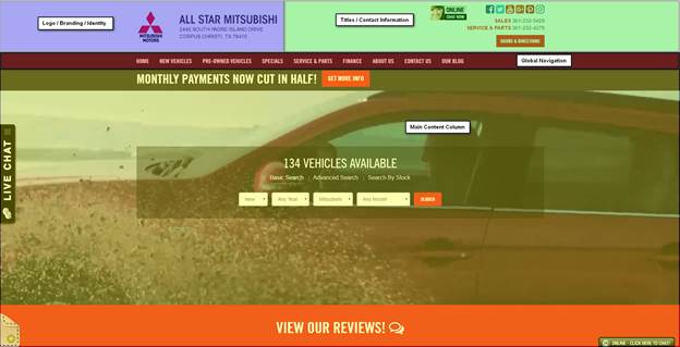
Every site will be organized slightly differently, but for the most part, that’s the universal template. Your mobile homepage will have a variation of the same layout as well.
Headers
Your homepage’s headers act a bit like a driver’s license for the page. They tell the visitor what site they’re on, what page they’re viewing, and how to get in touch with your dealership – all the basics. Consistent headers actually help people interpret webpages as part of your website. For example, consistent headers would tell someone that your service page and a vehicle detail page both belong to the same website, even though the content on the two pages is quite different.
Logos & Branding
Within your headers, logo and branding consistency is also a key part of homepage optimization. And just like with headers in general, it’s the absence that speaks volumes. A website with a different headers & logo placement on each page would be extremely hard to navigate, frustrating users. Moreover, having logos that aren’t hyperlinked to the homepage can contribute to that confusion as well. Again, being able to navigate from page to page (or get back “home”) is a function that most people come to expect now. Additionally, your logo should always be in the top left part of your header, paired with your dealership’s title.
Contact Information
In the olden days of website design, you would include a “Contact” link in the site’s footer, and your address & location were only visible after someone clicked through. While the “Contact Us” page is absolutely necessary, your address and phone number should also be spelled out in the top right header area. Instead of hiding your contact info on an internal page, display it at the very top of each page.
Global Navigation
Lots of websites (not just car dealer websites) rely on form submissions as a main source of internet leads. When site visitors want to interact with your dealership, they’re most likely going to fill out a form, exchanging some information for an appointment, a phone call, or maybe a coupon. So then, site navigation is incredibly important to optimizing for conversion, as are CTAs. As the heatmap below illustrates, most users read in an “F-pattern” and take in data from left to right, top to bottom – reading less and less as they scan down the page.
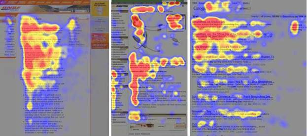
What does that tell us? Put all your pertinent links and CTAs in the red areas, where people’s eyes are naturally going. As far as global navigation goes, we see the best results when dealers put their “Home,” “New Cars,” and “Used Card” pages on the left hand side of their navbar, and the “About” and “Contact Us” pages on the far right. And here’s an extra tip: using a “home” icon on the navbar can help lower the number of people who click there as a “reset” strategy. Why? An icon is more subtle than plain text, and therefore a little less noticeable. Users are more likely to leave your website after resetting to your homepage, so you don't want to disrupt the conversion process if at all possible. While it’s not usually a good idea to use icons in place of text (it can get very confusing, very quickly), the “home” icon can help guide user flow to a CTA that your dealership has found to have a high conversion rate. To put it simply, don’t make it any easier than it already is for potential leads to get distracted and bounce off your site.
Extra Tips & Tricks
- Popups can be a high-volume lead producer when the offers are compelling and promise a savings or coupon.
- Any vehicle search function on your homepage should be above-the-fold.
- Eliminate any unnecessary widgets, as they increase site load time.
- Use drop-down inventory search bars when possible, as they’re still the #1 search method for car shoppers.
- Make any “floating” chat boxes static.
- Use colored vehicle photos on your model bar, white/silver are the least-clicked colors.
Mike is a core part of the DealerOn team, and has led a complete restructuring and rebuilding of DealerOn’s account management teams team into the best in the industry during his tenure. Mike is universally loved by our customers. His website optimization expertise combined with his retail sales expertise are invaluable assets to DealerOn’s clients. His consultative approach to working with dealers has facilitated a number of platform enhancements, helping maximize consumer engagement and lead conversion for our customers.
No Comments
DealerOn
6 Ways Not to Spend Your PPC Budget

Managing a PPC campaign can sometimes seem like a free-for-all effort. There are lots of options and lots of ways to spend your money - but not all of them are worth your time. I've spent years in the SEM/PPC world, and I've noticed a trend in the way ad budgets are structured. Here are 6 ways to avoid wasting your PPC budget, based on the most common mistakes I see dealerships make.
1. Running Ads 24/7
This might be the most common mistake I see when auditing PPC processes - and it's not unique to dealerships. For businesses that are closed at night and don't have a 24-hour customer support system or call center, running ads 24/7 is a sure-fire way to waste money. If your dealership is closed and can't follow up on a website lead, then why pay to drive traffic there? Imagine you have a compelling click-to-call ad that requires an internet sales rep to follow up with immediately. If the ad is being run 24/7, and someone happens to see it at 11:30 p.m., what happens? A whole lot of nothing. Make sure to double-check ads that are running nonstop, because if you can't actually follow up with the lead in a timely fashion, it's a wasted effort. Conversion rates on overnight leads don't have strong conversion rates, so allocate those dollars for ads during your dealership's business hours.
2. Text Ads in Google Display Network
Can you guess what's wrong here? Two words in the subheading above are a dead giveaway: text and display. You technically have the option to run text-based ads on Google's Display Network, but text ads are traditionally served in search engines. By serving text ads on image-heavy websites, your clicks may go down and your bounce rate may go up, as you're more likely to get accidental clicks from users who will quickly leave your site. Further, text-based ads don't look compelling next to display ads, and it's not an optimal use of your money.
3. Ads in Google Search Partner Network
I hate to say it, but not everything Google offers is a golden goose. In other words, just because it's an option for your PPC campaign, doesn't mean it's a good idea - even if it comes from Google. The Search Partner Network might seem like a great way to boost your impressions, but that metric is undermined by the quality of traffic you'll get, not to mention it will hurt your overall campaign metrics. If you extend your audience to the Search Partner Network, where conversion & click rates are obscenely low, you're simply lowering your overall metrics because it ties into your Google campaign as well.
4. Poorly Managed Negative Keywords
Your negative keywords help target qualified traffic, plain and simple. If you're not excluding negative keywords like "headlights" or "headrests" from your campaigns, for example, then you risk wasting your budget by serving ads to car customers who are looking to accessorize or repair - not buy. Determine your campaign goals and make sure that you exclude all unqualified traffic by adding in the appropriate keywords. Here's a pro tip: exclude other products by the OEM, if applicable. For example, Honda makes lawnmowers and cars, and serving an ad to someone who's trying to cut their grass is a prime example of doing it wrong.
5. Sloppy Copy
I'm not talking about grammar & verbiage issues (that should be at a premium!), I'm talking about how well the ad matches your landing page. Sad to say, misleading and/or poorly written ad copy is a very real problem that not only wastes money, but frustrates your potential customers. If your advertisement says or implies one thing, but your customer finds something very different on your site when they click through, you've lost that lead. And, of course, that can negatively impact your metrics. Just think about how frustrating it is to spend time & effort investigating what you think is a good deal, but turns out to be wrong.
6. No Ad Extensions
A robust, optimized ad is one that includes extensions. And that's not just a matter of opinion, failure to make ad extensions can rank you lower in Google's Search Network or even cause you to lose a bid to a competitor who did take the time to build out amazing extensions. If it's properly implemented, adding things like link, phone, and pricing extensions can help boost conversion rates significantly. But neglecting extensions is essentially keeping helpful information from your customers, who are eager to learn more (and fast) about their search query. Telling someone that you have new Toyota Camrys is nice, but what if the customer could look at inventory links, could see price ranges, could call you, and even see your address in the ad itself? It's easy to see how that ad would win over a plain-text ad.
Get Going
It's important to note that quite a few of these PPC mistakes are the result of an automated advertising strategy. And, let's be honest. If there's anything more frustrating than wasting money, it's paying a machine to do it for you. But that's not to say that all automated strategies are bad, there's a difference between "set it & forget it" and smart automation. For some dealers, automated processes are the only way to manage a campaign, due to sheer volume. If any part of your PPC gameplan is automated, then test it against these 6 common mistakes to make sure you're not "automatically" wasting money.
This post originally appeared on DealerOn's website.
Shaun is a true internet car guy and the Vice President of Marketing at DealerOn. His automotive internet career began in 1998 with the Reynolds and Reynolds team that launched Microsoft’s CarPoint.com, CarsDirect Connect, Yahoo Autos, Automark Websites and Reynolds Web Solutions. Shaun’s Marketing prowess coupled with expertise in Social Media allows him to effectively market DealerOn’s capabilities, extend its reach and build the right reputation. His unique blend of humor and automotive experience has made Raines a sought after speaker at industry events including NADA, NCM, Digital Dealer, DrivingSales Executive Summit and 20 Groups Shaun lives in Frisco, Texas with his wife, children and dogs, and he can be reached at shaun@dealeron.com.
1 Comment
Automotive Group
#7
dont spend your money with agencies who don't know the car biz. All they want you to do is giveaway free cars
DealerOn, Inc.
Design for the Device

Website design is about more than just having the sleekest, flashiest thing on the market, it’s about functionality. Above all, your site has to be useable, and that’s even more critical for your mobile site.
I’ve talked before about mobile optimization and different tips & tricks for boosting optimization. A lot of people tend to think that the “mobile” version of their website is simply a shrunken-down desktop version. But that’s not quite true, because there are some site elements that simple don’t translate very well from desktop to mobile.
Which ones are they? Good question.
Rotating Banners
This is a bit of double-whammy, because rotating banners don’t actually convert very well on desktop or mobile. However, while desktop click-through rates usually hover around 1% (with the lion’s share of the clicks going to Position 1 on the banner), mobile CTRs can be even lower.
Another huge reason that rotating banners should stay off your mobile site? Load time. Since about half of your site visitors will only wait 2 seconds for a page to load before leaving, those high-res sliders might cost you qualified traffic.
Printable Coupons
This is a classic desktop-to-mobile disaster. Printable coupons are a wonderful way to create a little incentive to come visit your dealership, but there’s one problem. Nobody prints from their phone, and if they’re looking at your coupon on their mobile device, the odds are pretty good that they’re nowhere near a printer.
This is where the eWallet functionality steps in and saves the day. A mobile site that integrates with Apple Pay and Android Wallet will let your users download & store coupons digitally. If you’re smart, you can set up a geo-fence to alert users when they’re near your dealership and can redeem the coupon. Customers download the coupon once, and you can update as many times as you wish.
Layers & Popups
There’s the old saying, “Less is more,” and it often applies to website design. Technology has advanced so far in the past decade, that designers & programmers have almost unlimited options at their fingertips when building a website. That doesn’t mean they should include everything, though.
Sites often use layers and popup features to highlight a chat window, or maybe some social media share buttons. Whatever you use them for, your mobile device screen is too small for that kind of digital real estate.
If your desktop site is seeing great results from the chat popup, that’s great. But take it off your mobile site, because it does little more than impede the browsing experience. It only takes a swipe of the finger to leave your mobile site, so don’t encourage people to bounce off your site by making it hard to scroll around.
Busy Navigation
Your navbar has all the essentials, and sometimes a little extra. For desktop site visitors, it’s critical to have easy, functional, and robust navigation so that all your content is easily accessible.
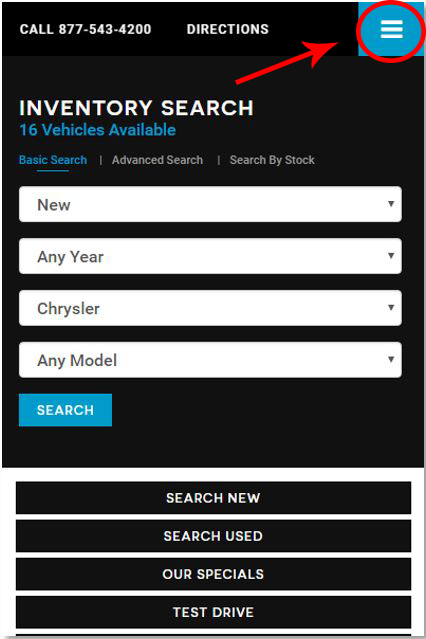
But mobile sites? There’s no need for all that content. The “hamburger” style menu lets you collapse the non-essentials out of sight, where they can be accessed with a quick tap.
Of course, your essential data still needs to be front and center. Put things like your phone number and your hours & directions into neat little icons on your navbar, and make it sticky if you’re feeling fancy. By doing so, users can take action with ease and they don’t have to go hunting for your “Contact” page or try and copy/paste your phone number.
Two Columns
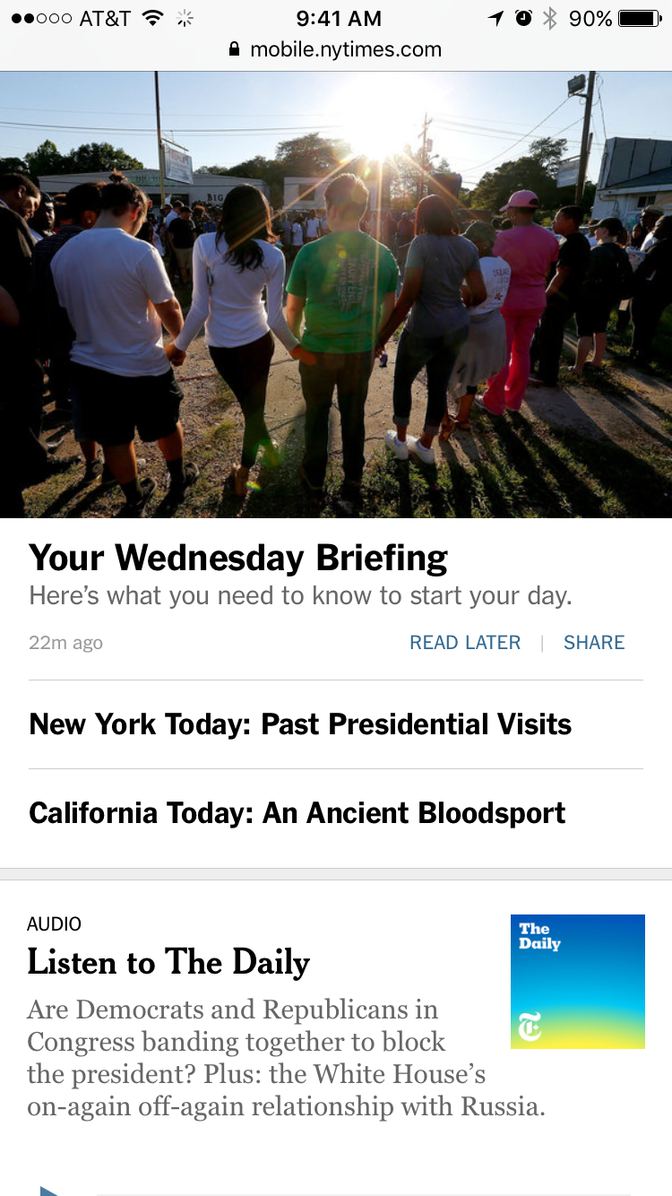 Desktop sites can look amazing with multiple columns, but it’s not a good feature on mobile. Why? The same reason we nixed the mobile popups: digital real estate. A smartphone simply doesn’t have enough screen space to afford a two-column design, so users end up trying to scroll to the left and right to see all your content. No good.
A single-column site will use large, clickable panes to display content - like the mobile version of the New York Times. Notice how the user doesn't need to swipe left or right to access content, it's all right there, optimized for their device. No need to zoom in, either, since the single-column makes sure everything is sized correctly.
The Bottom Line
When you really get down to it, people are using their phones to shop & price-check. So let them do it on your site. Don’t make mobile design an afterthought and assume that the truly loyal customers will simply remember to find your site on their desktop.
Google has consistently shown us that people, especially automotive shoppers, are doing their research in micro-moments throughout their day...and they’re not usually near a computer. So if the future is mobile, then where are you?
This post originally appeared on the DealerOn website, written by Michael DeVito.
Ali Amirrezvani co-founded DealerOn in 2004 with his brother and Partner, Amir. Ali with 11+ years of experience is considered one of the top minds of Digital Marketing in the industry and a frequently sought public speaker at NADA, Digital Dealer and other industry forums.
No Comments
No Comments