Dealer Authority
If You Sell EVs in these 11 States, You Want this Infographic

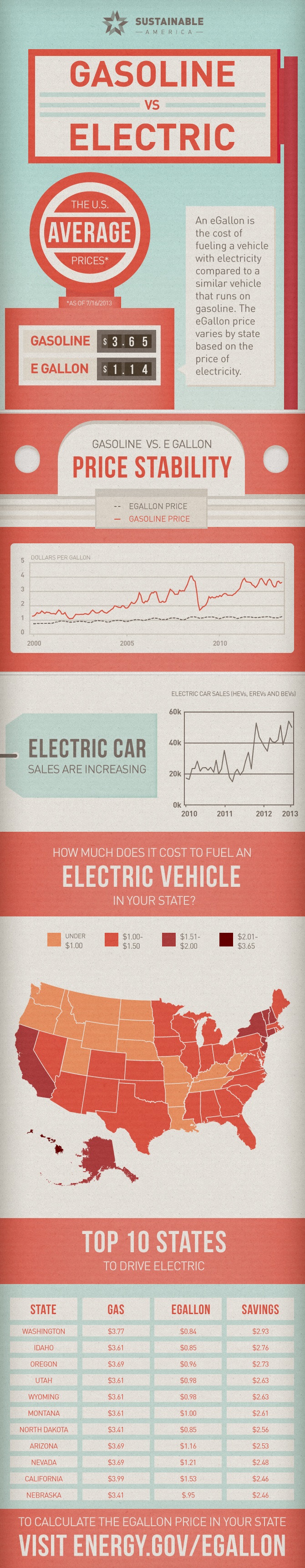
There are three prominent challenges with selling electric vehicles. They are generally more expensive than their gas counterparts, the infrastructure for refueling is a concern in some areas, and the long-term cost savings can be a challenge to demonstrate. If your dealership sells electric vehicles in the following 11 states, this infographic should be up on your showroom floor wall:
- Washington
- Idaho
- Oregon
- Utah
- Wyoming
- Montana
- North Dakota
- Arizona
- Nevada
- California
- Nebraska
These are the states where the difference between the cost of gas and the equivalent cost of a electrical recharging are the most pronounced. It's funny, as this infographic actually says "Top 10 States" while they list 11, but hey, it's better than listing 9.
Dealer Authority
2-to-1: The Magic Ratio for Twitter Image Marketing

Let's state this for the record. I am not convinced that using the new image features on Twitter is the best way to go when it comes to marketing your business. It still smells too much like spam and if it's not handled properly it could do more harm than good.
With that said, there are definitely instances when it could do VERY well, particularly when it comes to gaining exposure and picking up more Twitter followers. The key is making sure you're keeping a 2:1 ratio aspect ration for your images.
They are displaying that way regardless of the size or shape of the image when seen in the screen. They can be enlarged, of course, but that's so old school. With the new Twitter feed displaying them inline without a click and the fact that they've added the engagement actions under each post across all of the platforms, it makes sense prevent people from having to click to see the whole picture.
Look at the example below, a tale of two Tweets. As you can see, the top image that I just posted fits perfectly into the frame that Twitter gives us. The one below it forces you to click through to see it. It doesn't matter how compelling the message is, only a handful of people will click to find out what the punchline was. They're much more likely to skip right past it, particularly if they're like the majority who check Twitter on mobile.

If your images are twice as wide as they are tall or close to that ratio, you'll be able to get the most impact out of your Twitter image marketing. Don't go out and make a bunch of ads at that ratio. Again, this can be abused and you'll turn more people off than ever before if you spam the system (and feeds). Keep it legit and everything will be just fine.
No Comments
Dealer Authority
2-to-1: The Magic Ratio for Twitter Image Marketing
Let's state this for the record. I am not convinced that using the new image features on Twitter is the best way to go when it comes to marketing your business. It still smells too much like spam and if it's not handled properly it could do more harm than good.
With that said, there are definitely instances when it could do VERY well, particularly when it comes to gaining exposure and picking up more Twitter followers. The key is making sure you're keeping a 2:1 ratio aspect ration for your images.
They are displaying that way regardless of the size or shape of the image when seen in the screen. They can be enlarged, of course, but that's so old school. With the new Twitter feed displaying them inline without a click and the fact that they've added the engagement actions under each post across all of the platforms, it makes sense prevent people from having to click to see the whole picture.
Look at the example below, a tale of two Tweets. As you can see, the top image that I just posted fits perfectly into the frame that Twitter gives us. The one below it forces you to click through to see it. It doesn't matter how compelling the message is, only a handful of people will click to find out what the punchline was. They're much more likely to skip right past it, particularly if they're like the majority who check Twitter on mobile.
If your images are twice as wide as they are tall or close to that ratio, you'll be able to get the most impact out of your Twitter image marketing. Don't go out and make a bunch of ads at that ratio. Again, this can be abused and you'll turn more people off than ever before if you spam the system (and feeds). Keep it legit and everything will be just fine.
No Comments
Dealer Authority
Four Quick Growth Stats About Google+

Yes, I know I've been on a Google+ kick lately, but it has been it's like Michael Corleone in Godfather 3. "Every time I think I'm out they pull me back in."
Hopefully, I won't have a heart attack immediately after saying the line the way that Al Pacino's iconic character did. Also, I'm not in the mafia, in case you were wondering. I am, however, fully entrenched into Google+, which is why these stats mean something to me. Hopefully, they'll mean something to you as well.
I would love to connect if you want to circle me there: https://plus.google.com/+JDRucker/posts
* * *
Infographic courtesy of Mihi Digital.
No Comments
Dealer Authority
Four Quick Growth Stats About Google+
Yes, I know I've been on a Google+ kick lately, but it has been it's like Michael Corleone in Godfather 3. "Every time I think I'm out they pull me back in."
Hopefully, I won't have a heart attack immediately after saying the line the way that Al Pacino's iconic character did. Also, I'm not in the mafia, in case you were wondering. I am, however, fully entrenched into Google+, which is why these stats mean something to me. Hopefully, they'll mean something to you as well.
I would love to connect if you want to circle me there: https://plus.google.com/+JDRucker/posts
* * *
Infographic courtesy of Mihi Digital.
No Comments
Dealer Authority
Build Websites for Mobile First

Earlier last week I wrote a controversial piece about responsive website design that brought the ire of professionals within my industry and a flood of emails calling me all sorts of names. Yes, there were those who agreed as well, but they were the minority.
In retrospect, I sold out. I looked at the data, saw how responsive websites were not performing very well on mobile devices in industries that were heavy on data, and came to the conclusion that adaptive was a better solution for some. I stand by that statement based upon practicality, but there's an addendum to that answer: if you want to do the absolute best practice possible, it would be to build your website from mobile up rather than from PC down.
It's always easier to make a site more complex than to simplify it. Adding features is simply easier than taking them away. If you build your websites with the following three ideas in mind, you have the greatest chance for success:
- Mobile is huge and getting huger. Assume that your website will be accessed as much if not more on mobile devices in the near future than on big screens.
- People love mobile designs because they're used to them. If a website displayed on a PC operates much the same as it would on a mobile device, it will perform better. That's not to say that you need to sacrifice design or make your website look amateur on a big screen, but strive to make it "mobilesque".
- Touchscreen functionality and the art of scrolling rather than clicking is becoming more of a "thing" for desktop websites. Keep that in mind when you build pages.
If you take into account how your website will load, operate, and perform on mobile devices and build up from there, you will find that your overall website performance will improve. The problem with responsive websites in some industries is that they cram as much as they can to fill out the big screen and then it looks terrible and performs poorly on the small screen. Work from the small screen up and the website will do better regardless of the device.
* * *
Article originally posted on Soshable.
No Comments
Dealer Authority
Build Websites for Mobile First
Earlier this week I wrote a controversial piece about responsive website design that brought the ire of professionals within my industry and a flood of emails calling me all sorts of names. Yes, there were those who agreed as well, but they were the minority.
In retrospect, I sold out. I looked at the data, saw how responsive websites were not performing very well on mobile devices in industries that were heavy on data, and came to the conclusion that adaptive was a better solution for some. I stand by that statement based upon practicality, but there's an addendum to that answer: if you want to do the absolute best practice possible, it would be to build your website from mobile up rather than from PC down.
It's always easier to make a site more complex than to simplify it. Adding features is simply easier than taking them away. If you build your websites with the following three ideas in mind, you have the greatest chance for success:
- Mobile is huge and getting huger. Assume that your website will be accessed as much if not more on mobile devices in the near future than on big screens.
- People love mobile designs because they're used to them. If a website displayed on a PC operates much the same as it would on a mobile device, it will perform better. That's not to say that you need to sacrifice design or make your website look amateur on a big screen, but strive to make it "mobilesque".
- Touchscreen functionality and the art of scrolling rather than clicking is becoming more of a "thing" for desktop websites. Keep that in mind when you build pages.
If you take into account how your website will load, operate, and perform on mobile devices and build up from there, you will find that your overall website performance will improve. The problem with responsive websites in some industries is that they cram as much as they can to fill out the big screen and then it looks terrible and performs poorly on the small screen. Work from the small screen up and the website will do better regardless of the device.
No Comments
Dealer Authority
The Facebookification of Twitter Makes Scrolling the New Click

We are seeing the "Facebookification" of Twitter happening before our eyes. No longer will we see a nice, minimized feed of Tweets presented to us on our smartphones or computers with several Tweets lining top to bottom on the screen. We'll see pictures, ads, and videos taking up more space by themselves than three Tweets presented the old way.
We will see Facebook. Rather than comment, we will be able to reply. Rather than share, we will be able to retweet. Rather than like, we'll be able to favorite. These are not new interactions that you can have with your Twitter feed - they've been available all along. The difference is that now they're present in the stream under each new post, just like Facebook.
Any change like this will have good and bad associated with it. The good is that some, particularly those who have a properly vetted and tightly pruned list of people they follow, may find that this change makes it easier to experience Twitter, particularly on a smartphone. The need to push the little picture link in the Tweet has been replaced by the need to scroll further to see more. The need to open up a Tweet in order to interact with it has been put inline within the feed, again making for fewer Tweets per screen but an easier path to engagement.
The bad is that this will utterly destroy the Twitter feeds of anyone with a poor list of accounts they follow. Businesses are going to fall into a trap thanks to this new expansive Twitter feed. It's possible that things you would never want to see on Twitter are now exposed rather than hidden safely behind the wall of a necessary click.
Overall, this is a great move from Twitter's perspective pre-IPO. They will be catering now to the people checking out the service for the first time before investing rather than the experienced Twitter user who knows how to play the game. It makes sense - the old users will adapt and the new users will be able to figure it all out more easily. If they've been on Facebook, they'll probably recognize many of the functionalities that are now common between the two networks.
Now, about that business trap...
Don't Flood the System

I'm already starting to see it. Businesses and marketers are seeing things in their feed and realizing that they can get their visual message out to people more readily. They don't have to click to see images, so why not put the messages in the images themselves, right?
Wrong. For some reason, the old ways of thinking with captive audience marketing have never been abandoned in free audience marketing. You can load people up with all of the ads and business messages that you want on television, print, or radio, but the moment you post something to social media that might turn the audience off, they can easily turn YOU off by unfollowing you. Some would say that the remote control and the car radio tuner have the same basic effect, but it's not true. They might turn the channel during commercials, but they will likely return to the station and give you a second, third, fourth, or tenth chance to reach them with a different commercial later, but in social media, when they "change the channel" by turning you off, you will likely never have another opportunity to reach them.
Businesses, this is a tremendous opportunity to truly participate within the Twitter community in ways that have eluded you since the beginning, but that's not a license to flood people's feeds with material that won't resonate with them. The example above isn't that bad. It's just an announcement that someone had joined the team, but it's enough to make me want to unfollow them. No offense to the person who joined the team but I don't want those things popping up on my smartphone.
Thankfully, I don't follow those who blatantly spam all the time, but I've seen other feeds with marketing messages embedded into images that will clearly turn people off.
Twitter is in a constant state of flux and this latest change is going to be embraced by some, panned by others, but eventually accepted as the norm for all. We've transitioned from the click to the scroll as the general method for seeing more. It was described best in the best article I've ever read on Buzzfeed:
What this Twitter update does, in that context, is lower the barriers for interacting with tweets, which in turn reduces the threshold for sharing and for virality. It turns Twitter into a more unstable, interactive, sensitive, and potentially explosive ecosystem, a place where you feel like you at least have a chance of breaking through.
No Comments
No Comments