DealerOn
Is your dealership site too slow for Google's new mobile speed update?

Everyone knows that that page load speed on your website is important, especially when studies show that 40% of visitors will leave a page that takes more than 3 seconds to load. Since we’re now living in the age of mobile, when customers want answers at the tips of their fingers (and they want them now), having a fast mobile site has never been more important.
Speed has been a ranking factor in Google’s algorithm for a long time, but only for desktop sites. It was recently announced that mobile page speed will start to count as a ranking factor in July, so it’s time to find out if your dealership’s site measures up to Google’s standards.
Google’s calling it the Speed Update, and though Google has stated that it will only impact sites that “deliver the slowest experience to users,” you need to follow best practices now so your site isn’t one of them. If you’re worried that your mobile site is too slow to keep up with this impending update, don’t panic just yet. The Speed Update will only affect a “small percentage” of queries.
And as far as best practices for mobile site design, we won't go into the gory details because we've written about that sort of thing before. Just make sure you're not using rotating banners, you've disabled the popovers and layers, etc. Get a complete list of the mobile design do's & don'ts here.
Now that mobile web use has exploded, Google is releasing this update to put the emphasis on user experience. The intent of a query is still the strongest signal, so don’t start focusing on streamlining load time while neglecting your content. User experience should always be your focus when creating content anyway, so your most important goal remains making content that’s relevant.
It's worth mentioning that writing in a natural and conversational language is the best way to improve user experience on your site. In other words, be authentic, concentrating on local info rather than trying to optimize for every big city next door. Another way to make your content locally relevant is by posting useful tips about your local area - things that your visitors can actually use - on your blog or on social media.
At the end of the day, what Google really wants is a seamless search experience coupled with an amazing user experience. With this upcoming update, they’re going to prioritize sites that deliver a speedy experience on mobile. Now, is this update going to have a huge impact on your rankings or visibility when it’s released this summer? Probably not, but following best practices and putting your customers first is always the best strategy.
DealerOn
Here's How Facebook Marketplace Will Impact Automotive

Bob Dylan hit it on the head when he said, “The times, they are a-changin’.” Few things change as quickly as technology, and automotive isn’t exactly shy about keeping pace. That is to say, dealers have been using technology to sell cars as soon as it hits the market.
Well, some of you may have heard about the new kid on the block: Facebook Marketplace. That’s right, Facebook has started to include car dealerships in their Marketplace platform. With the introduction of Facebook Marketplace in October of 2016, they’ve become a serious competitor to sites like eBay and Craigslist with their social media-driven version of “the classifieds.” But Facebook has recently announced their intentions to include the automotive industry by partnering with some digital agencies like cars.com and CDK to connect digital inventories to the Marketplace. So, what does this mean for dealers?
Let’s talk numbers. The biggest thing Facebook Marketplace has going for it is clearly the sheer size of its reach. If just 4% of the 1.7 billion users who currently use Marketplace start selling or buying used vehicles via this platform, Facebook could suddenly contend with sites like Autotrader, who currently have 38 million users, or eBay motors, who have 168 million.
What’s unique about Facebook’s Marketplace, though, is that it depends (significantly) on the interconnected Facebook community. Transactions become more upfront and personal when buyers can view the profiles of their sellers, making the anonymity of Craigslist and other sites seem untrustworthy by comparison. The added bonus of the built-in Facebook Messenger also makes inquiries easy and casual. However, despite its potential reach, Marketplace is still struggling to brand itself as a vehicle listing platform, and is still behind on functionality when compared to its competitors. But Facebook is starting to take notice of these shortcomings and is continuing to add new features, like more specific search fields.
Some dealers are starting to try this budding platform by listing their inventory on Marketplace, but there are a few restrictions to keep in mind:
- This feature is only available to dealerships working with certain Marketplace partners: Auction123, Cars.com, CDK Global, Edmunds and SOCIALDEALER.
- Dealerships can only list certified pre-owned vehicles on Marketplace
- Dealer listings appear with individuals selling their pre-owned vehicles. However, buyers can filter out individual listings to only view dealers and vice versa.
- Car purchases cannot made on Marketplace; sellers and buyers are only connected via the platform.
We’ve been watching this trend closely at DealerOn, and we’re actually conducting an in-depth 30-day case study to determine if this new feature from Facebook can actually help dealers sell more cars — and at a cost that makes sense. We’re always eager to test out any tool that helps our clients make more money, and we’ll summarizing our findings for you so keep an eye out for part two!
No Comments
DealerOn
How To Navigate Error Pages Like An Expert

To err is human, and to get an error page is just another part of having a website. We’re all uncomfortably familiar with the 404 error page, but that’s just the tip of the iceberg. There are plenty of other ways you can cause an error, and a few things your visitors can do too. If you find yourself at a loss when trying to decipher an error page, start here with our guide to the most common errors, especially if you’re trying to decide if the problem is due to your site or if it is caused by a visitor’s browser.
Error 404 Not Found
We’ll start off with the notorious 404. Anyone who’s used the Internet has encountered this one. A 404 error occurs when a visitors tries to access a web page or resource that doesn’t exist. The fault could be with either you as the website owner, like if you moved a page without redirecting (we’ve got some tips on that too), or it could from a mistyped URL, which would make it the user’s issue.
Error 400 Bad Request
Another common error, the 400 error page shows up when a request gets lost in translation. Somewhere along the line a user’s request was corrupted on its ways to the server, and the web server just doesn’t understand what’s being asked of it. Lucky for site owners, you’re off the hook, since this is usually a problem on the user end.
If you do happen to encounter 400 error, there are a few things you can do. The first step is always to double check your URL and make sure you didn’t mistype it. You can also trying clearing your browser cookies, since sites may report a 400 error when a cookie is read as corrupt.
Error 403 Forbidden and Error 401 Unauthorized
This two aren’t the same, but they have enough in common we decided to put them together. A 403 error means that the page that’s being accessed is forbidden. Unless you as the website owner accidently made a public page unavailable, then this error is the fault of the user for trying to access a something that they shouldn’t.
A 401 error is similar and occurs when a user is trying to access a page that they aren’t authorized to. Usually this happens after a failed login attempt.
Error 500 Internal Server Error
This one, according to Google, is the most popular error of all. This error occurs when something with the site is wrong in general. This could be due to the web server being overloaded, a permissions error, a PHP timeout, or a host of other issues. Unfortunately, this one is rarely caused by the user end, and will need the site owner’s attention to solve.
You’re going to get error pages on your site, and sometimes it’s going to be your fault. The best way to avoid this is to audit your site periodically and always double check your links after you redirect. Sometimes problems just happen, and it’s always better to be prepared.
No Comments
DealerOn
The ADA Update is Almost Here. How Accessible is Your Site?

With an upcoming update for the ADA (American with Disabilities Act), let’s take just a few minutes and talk about what this means for website owners. The ADA was signed into law in 1990, and was designed to prevent discrimination against marginalized groups. When you see a ramp next to a set of stairs or sign language interpreter, you’re seeing the effects of this law. What many people don’t know is the ADA’s effect on website accessibility.
The words “website accessibility” aren’t expressly written in the ADA, but the Title III section discusses discrimination in “places of public accommodation.” This phrase originally referred to brick and mortar stores, restaurants, and other places of business that were open to the public, but in recent years it’s also begun to apply to websites. After a landmark case in 2015 involving Netflix and the National Association of the Deaf, where a judge ordered the streaming company to include captions on all their videos and to pay $755,000 in fines, the ADA compliancy guidelines changed how we approach website accessibility.
But what does all this mean for you? Since that 2015 case, website providers have taken ADA guidelines seriously, which means your site should too. Though there are no official ramifications imposed by the Department of Justice for noncompliance, sites that don’t meet these guidelines are in danger of lawsuits similar to the Netflix case.
In 2017, DealerOn completed a year-long project that focused on adjusting pages and forms to meet ADA guidelines, and included working closely with our third party vendors. We strive to meet ADA guidelines by actively training our support, implementation, and design teams to spot common noncompliance issues, and we are always able to run audits and offer fixes for dealers who are concerned about their site’s accessibility.
The best course of action is to be prepared and stay informed. Know what guidelines are required and how your site can best meet them, and stay on top of new updates in the industry. If you want to stay ahead of the curve, you can read up on ADA guidelines here.
No Comments
DealerOn
Four Mobile Design Elements That Will Never Go Out of Style

It’s hard to keep up in the ever-evolving world of mobile devices. Earlier this year we wrote about design features for mobile that should never see the light of day, and all of that is still true, but you still have to figure out what your site should look like when someone’s holding it in their hand. Lucky for you, there are a few design elements that won’t be losing their effectiveness anytime soon. If you stick with them, you’ll be headed in the right direction.
If they can’t call you, what are they doing there?
I could go on and on about the importance of precise, customized CTAs that reflect your product or service, but even with a great CTA on every page, if your visitors can’t call you from their phone, then they won’t be hanging around for long. And I’m not talking about just including your phone number somewhere on the page, I mean an easily clickable button that allows visitors to call you straight from your site.
I know calling is slowly going out of style, but people still recognize that the thing in their hand is a phone, which means a click-to-call button is essential. That’s what phones were made for, after all.
When it comes to images, “big” is in
The screen on your phone is already small, so don’t make things worse with tiny graphics that don’t do your products justice. Show off what you’ve got with clickable, full-width images that lead your visitors further down the buyer’s journey. To get attention from Google, your images should be large enough to easily tap without slowing down load time. Find that balance, and you’re in the sweet spot.


Don’t forget to KISS: Keep It Simple, Stupid
Visitors on mobile aren’t performing the same kind of in-depth research as they would on a computer. They’re looking for the facts and they want them fast, so give the people what they want. Prioritize the information presented on mobile to the essentials for quick browsing, and leave the details to another page. Make your copy on product pages concise and to the point, and layer the rest further down on your navigation bar.
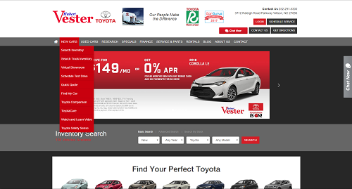
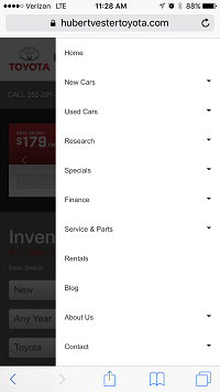
Compare the navigation bar on this home page. On desktop, the navigation drops down to a more detailed inquiry.
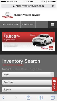
On mobile, the navigation is out of the way to avoid clutter.
Your goal on a mobile browser is to make your visitors’ experiences as frictionless as possible. What may appear detailed on a desktop ends up looking cluttered and overwhelming on smaller devices. Keep your visitors happy by only showing them what matters most. If they’re interested to know more, they can always use your click-to-call button.
Save the “fill in the blank” for a computer
Nobody likes typing on a phone. It’s difficult and awkward and no one’s fingers are small enough to work the tiny buttons without typos. Save your visitors the trouble by limiting the need to type on your pages.
Your search widget is going to be one of your most popular features, so make it easy by offering drop-down selections. If your mobile visitors do make it all the way to a form, you can’t avoid the need to fill it in, so make sure it’s large enough that they can see what they’re doing.
In general, people use their mobile device to find out more about a product. They’re using a convenient tool to get more information, so give it to them in a convenient way. Make your mobile pages easy to navigate with concise copy that focuses on the essentials, and don’t make visitors work too hard to find out what you’re all about. Give them images they can actually see and click, and try to avoid making them type something out. If you follow this advice, you’ll be at a good jumping off point.
Michael oversees the Design, Development and Production departments at DealerOn in his role as the Chief Creative Officer. With 15 years of experience in multimedia/web design, Michael is an expert in interactive design, UX, brand identity design, content creation and print collateral. He has worked as a designer, writer and art director for a variety of companies including Marvel, DC Comics, Cartoon Network, Comedy Central, and MTV.
No Comments
DealerOn
Four Things You Should Never Do When Redirecting
Whether you’ve moved your site to a new domain or are testing out a new update, eventually you’re going to have to redirect one of your URLs. This can either be a simple process, or be the cause of annoying errors and slow load times that frustrate your visitors and increase your bounce rates.
If you want to avoid slowing down your site, keep these four rules in mind and your redirects will have no problem running smoothly.
- Don’t Create Redirect Chains
A redirect chain is a series of redirects that take multiple steps between an initial URL to reach the final URL. With each redirect, search engines have to move through each individual link before reaching the desired page, creating an unnecessary wait and a longer page load.
These redirect chains generally happen over time as new pages are created. URL A may have been redirected to URL B in January, and then later in March URL B is redirected again when an updated URL C is created. This creates a double redirect chain: URL A>URL B>URL C.
Luckily, this is an easy fix. Take the original URL A and set up a redirect directly to URL C, and cut out the middle man. This not only speeds up load time, but also makes it easier for search engines to find your pages since they don’t have to crawl through multiple links.
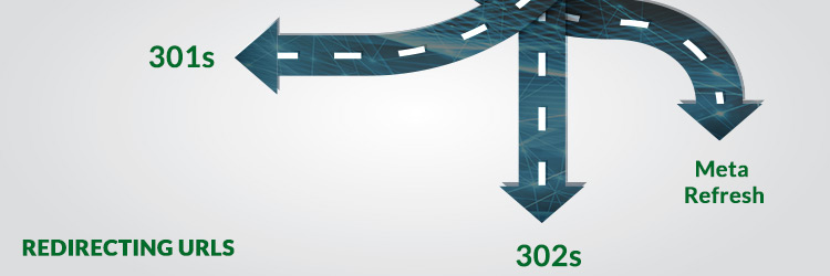
- Don’t Use the Wrong Kind of Redirect
There are multiple kinds of redirects, which I could do an entire post on itself, but here I’ll just concentrate on the three most popular.
301: Use as a permanent redirect, the 301 redirect is best used when an original URL is permanently replaced with a new one.
302: Not as reliable as a 301, a 302 redirect is used for temporary redirects. This should be used if you plan on returning to the original webpage in the future. These could be used if you want to test an update to a page before permanently making any changes.
Meta Refresh: These redirects are slower and generally not as useful as others. When you come upon a page that counts down at five second delay, these are usually meta refresh redirects.
- Don’t Create Redirect Loops
A redirect loop occurs when a redirecting URL directs to a new URL, which then directs back to the original URL. Obviously, you don’t want to send your users into this never-ending cycle, or leave them looking at an error page.
- Don’t Worry About PageRank
In the past, every time a page was redirected it lost some of its PageRank value. Google would penalize pages with a 15% loss of PageRank for 301 redirects, and a 100% for 302s, which made most website owners think twice before redirecting any URLs. But last year Google announced that would no longer penalize these kinds of redirects. Of course, PageRank isn’t the only SEO factor to consider, and a page’s traffic should be carefully watched if you decide to redirect to a new URL.
No Comments
DealerOn
Stay On Top by Sticking to the Bottom

Put your most important information above the fold—that’s what the newspaper editors of old did, and it’s a practice that web developers still follow today. Above the fold content includes anything position in the uppermost part of a webpage, where it is visible to users without scrolling. When you only have four seconds to get your visitors’ attentions, it makes sense to optimize your above-the-fold content in order to keep them coming back for more, but once you’ve got them caught, how do you reel them in?
As soon as your users get started in the buyer’s journey, you need to start thinking about the rest of your page design. Not optimizing your below-the-fold content means you’re missing out on some great opportunities to turn a lead into a buyer.
Stick to these best practices when it comes to optimizing for the bottom of your webpage page, and you’ll be heading to the top in no time.
Don’t Disrupt the User Flow
When optimizing for below the fold, you don’t want to take away from the primary goal of your page’s content. You won’t do yourself or your users any good by distracting them from their purpose. You want to nudge them along the buyer’s journey by providing relevant links or buttons to other pages that may interest them. If your users are viewing an inventory page for new vehicles, for example, it may be useful for you to offer links that promote used vehicles or similar options.
Inform on New Campaigns
If you want to create a buzz on a special offer or new campaign you’re running, the bottom of the page is a great place to get the word out. Create a banner that you can strategically place below the fold to generate some conversions for this new release.
If you’re including any CTAs in this kind of content, remember the 5 questions for successful CTAs. Keep your CTA’s purpose in mind when deciding your message, as you want to be specific and urgent while still staying unique to your campaign, and remember that your design should stand out without completely disrupting your page. Use contrasting colors, and stay away from obnoxious, flashing animation. To avoid distracting users from their reason for being on that page in the first place, be sure any landing pages open in a new tab.
Design Strategic Banners
If you’re including a banner at the bottom of your page, whether as a way to nudge your users along the buyer’s journey with related links or to draw attention to campaigns, there are a few things you should keep in mind.
You’re already off to a good start by having a banner near the bottom. I’ve talked before about the dangers of banner blindness, but placing one below the fold is a great way to avoid desensitizing your users to your banners. When designing your banners, just like your CTAs you want to follow the design of your page while still standing out with contrasting colors.
Remember Mobile Browsers
Whenever you're optimizing your site, you have to keep in mind that a significant amount of your visitors will be on mobile devices. Be sure that your buttons and links are easily clickable and that your content is easy to read, or risk a high bounce rate when your users get frustrated with your design. Usually, banners or buttons added above the fold tend to push your primary content down the page and out of sight when viewed on mobile, and you have to take this into consideration when designing. But when optimizing a button for the bottom of the page, you're in the clear!
You can spend countless hours optimizing for the top of the fold of all your webpages, and in the meantime the bottom of your pages are getting neglected. Don’t let one outshine the other—remember these tips for the bottom of the fold and you’ll stay on top of your game.
Mike is DealerOn's Vice President of Customer Experience. He has an extensive retail automotive background. He worked his way up the ranks at DARCARS Toyota, becoming a member of Toyota’s Silver Sales Society and the top sales consultant for the entire DARCARS organization in 2009. Mike has been with DealerOn for almost 8 years, having led a complete restructuring and rebuilding of DealerOn’s account management teams into the best in the industry during his tenure.
No Comments
DealerOn
Top Three KPIs to Measure Local SEO Success

The top ranking factors for successful SEO is old news. We get that content is king, that our pages should be filled with high-quality content and be helpful and informative, and we know that backlinks have a huge impact on rank.
But once you’ve got your Local SEO campaign up and running, how do you know if it’s working? How can you really tell if your efforts are being put to good use? Take a look at our list of KPIs for Local SEO to see if your campaign is making any headway.
Organic Traffic
Probably the most obvious measurement, your organic search traffic is one of the clearer indicators of your Local SEO reach. You can view your organic search traffic in Google Analytics by going to Acquisition>All Traffic>Channels in your Channel Grouping report. Take a look at your Sessions. This is the number of user interactions that, according to Google, “take place over a given time frame.” Comparing this data month by month will give you a good idea of the long term effects of your efforts.
Referrals
Referrals include the websites that have referred visitors to your site through links, and omits data like visits that were brought through advertisements or through organic search. Your referral report will not only show you the amount of traffic that other sites are sending your way, but also how much engagement you’re getting from these visitors.
To view your Referral Report, head over to Acquisitions>All Traffic>Referrals and you’ll see the list of sites that are bringing in your traffic. A successful SEO campaign will have a good amount of traffic from referrals, but you can also see the bounce range, session duration, and conversion data to show how much engagement you’re getting from those referrals.
Reviews
You can’t underestimate the importance of reviews, especially when looking at a local SEO campaign. Local businesses with a significant number of quality reviews can jump to the top of the SERP, and will reassure people that their services or products are trustworthy and worth doing business with.
There are plenty of sources for reviews—Google Reviews, Yelp, and Bing Places just to name a few. To measure how successful your reviews are, you have to look beyond sheer numbers. Google can tell that when all of your 1,000 reviews are 5 stars, something is up. A solid number of honest reviews will take your business much further.
Putting together an active Local SEO strategy is half the battle, but after you’ve put your plan into action, you can’t forget to look back and evaluate. Take into consideration these three KPIs when measuring your impact, and you’ll have a better idea of where to go for the future.
Greg Gifford is the Director of Search and Social at DealerOn. He has over 15 years of online marketing and web design experience, and has specialized in automotive SEO for the last 5 years helping hundreds of auto dealers thrive while the industry has struggled during the recession. Greg speaks internationally at both automotive and SEO conferences, teaching thousands of small business owners and marketers how to get their sites to show up higher in local search rankings.Greg also spends his spare time doing freelance website design and SEO for local businesses. He graduated from Southern Methodist University with a BA in Cinema and Communications, and has an obscure movie quote for just about any situation. He is an international SEO speaker, and currently serves as a member of the Board of Directors for the DFWSEM, an organization dedicated to promoting search engine marketing through best practices.His local search tips and tricks can be easily found online and Greg can be reached at GGifford@DealerOn.com.
No Comments
DealerOn
Dissecting Your Website’s Anatomy

Understanding the anatomy of a well-optimized site isn’t brain surgery, but it’s one of those fundamentals that you just can’t ignore. In order to provide a seamless experience for your site visitors, you should have the basics of site structure down to a science.
To produce a finely tuned website specimen, there are a few variables you should keep in mind. These basic points will ensure your site is a proven success.
Organization
Before you even begin to build pages, you need to know how your site will be organized. To do this, you’ll want to map out where your pages are going. To do this, you can use a software tool or get back to the basics and map it with a pencil and paper.
I recommend that you stick to a pyramid hierarchy. The top of your pyramid being homepage, supported beneath by the main categories that will be featured on your navigation menu. When choosing these categories, remember that the fewer the better. You want to include all the necessary information without unloading the entire contents of your site on your navigation menu.
It’s also important that you ensure your URL structure follows this hierarchy. This will keep your content organized and help you visitors navigate to their wanted information.
Categorizing Content
Now that you know what categories to include in the navigation menu, you have to start thinking about the kind of content that will appear beneath them. In keeping with the pyramid hierarchy structure, you’ll have to identify what content is important in establishing the purpose of your site, as this kind of content should be fairly high up in the hierarchy as subcategories.
Too few subcategories can lead to disorganization and confusion, and too many creates a shallow site structure that makes a homepage messy and difficult to navigate. If you find that one subcategory is too large, split it into two. Finding a balanced number of categories and subcategories is key to a successful site anatomy.
Internal Linking
All of your pages should link to another in some way. An easy tactic for this is to have each page with one in-coming link from a different page and one out-going link to relatable content.
Allowing for an internal link structure also makes your site more easily “crawable” by Google. Linking to your pages ensures Google can find them, which increases your SEO. Keeping this in mind, it’s important that outdated pages are either deleted or redirected to relevant content, or you risk denting your overall ranking.
After spending countless hours preparing the complex, cutting-edge strategies that make up your digital marketing, it’s easy to forget about site structure. But at the end of the day, all of your online marketing comes back to your site, and you want to leave those visitors wanting more.
Michael joined DealerOn in 2011 and oversees the Design, Development and Production departments at DealerOn in his role as the Chief Creative Officer. With 15 years of experience in multimedia/web design, Michael is an expert in interactive design, UX, brand identity design, content creation and print collateral. He has worked as a designer, writer and art director for a variety of companies including Marvel, DC Comics, Cartoon Network, Comedy Central, and MTV.
No Comments
DealerOn
Website Conversion 101: In-Site Search Options

When users visit your dealership’s site they want to get right to the point. They want to know what’s in stock and what features your vehicles have and they don’t want to waste time. That’s why most visitors are immediately drawn to your search widget.
You have a lot of choices when it comes to your in-site search options, so there are a couple of questions you should be asking. How specific do you want your search options to be? How should it appear on a desktop versus a mobile browser? What exactly are my users searching for?
But don’t worry, I’ve done the hard work for you. I researched different search options and found some of the pros and cons.
Open Search Fields
A simple way to add a search option to your site is with an open search field. Similar to a regular internet search bar, only this widget would be specific to your website. This a simple option, since visitors can search for anything that they come up with, however if a search isn’t specific enough, or even too specific, it will spit out zero results. Site visitors might think you don’t have what they’re looking for, and then your potential customers become frustrated and your dropoff rates skyrocket.
Very few sites utilize open search fields, preferring instead to offer a few search variables. We found in a recent study that the majority of searches performed with an open search field were on stock numbers. This means open search fields are only really being used by dealership employees, rather than by clients. Probably not the best way to make a sale.
So What Search Fields Do I Include?
If you do decide to be more specific with your search option, you’ll need to know what fields to include. Fortunately for you, again, I already did the research and found which fields users prefer. I’ve listed them below from most to least important:
- Model
- Year
- Make
- Body
- Price
Desktop vs Mobile Browsers
In today’s technological age, you always want to consider mobile browsers when making decisions about your site. Your search option should look different on your desktop browser versus your mobile, starting with its shape. As we know, desktops are horizontal rectangles while mobile phones are viewed as vertical rectangles (usually). Take these different formats into consideration when designing your site and choosing your search widget.
We know that search widgets are used more often on phones than on desktops, so it’s important to make your search option easy to find immediately upon entering your site.
Here are some good examples:
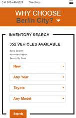
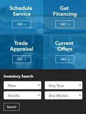
Your search option is a frequently used tool on your dealership’s site, and is sometimes the first step a visitor takes to becoming a lead. Remember to use familiar fields and to optimize for mobile browsers so you can create an easy, enjoyable experience for your site visitors.
It’s much easier to give your customers options to choose from when searching for their next vehicle, because the odds are pretty high that they won’t type with 100% accuracy, or remember every single trim level for every single car they’re researching.
As with most things regarding your website, you never want to make potential customers do more work than they have to, and filtered site search, along with the best practices I’ve outlined here, is a great way to lighten the load.
Mike is DealerOn's Vice President of Customer Experience. He has an extensive retail automotive background. He worked his way up the ranks at DARCARS Toyota, becoming a member of Toyota’s Silver Sales Society and the top sales consultant for the entire DARCARS organization in 2009. Mike has been with DealerOn for almost 8 years, having led a complete restructuring and rebuilding of DealerOn’s account management teams team into the best in the industry during his tenure.
No Comments
No Comments